When your living room feels cramped, it’s rarely about square footage alone. It’s about how the space is used, organized, and laid out in everyday life. You might love a bright, cozy feel, but a few well-placed changes can reclaim inches you didn’t know you were giving away—and make the room actually work for you, not against you. This article walks you through 20 specific mistakes real homes make, why they happen, practical fixes you can implement this weekend, and exact steps to take in small apartments, rental homes, and busy households on realistic budgets.
1. Visual crowding from too many low-profile textiles
A. The problem
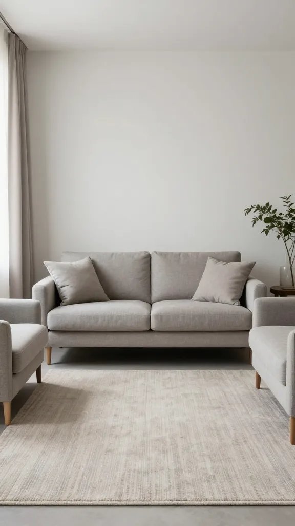
A couch, chairs, cushions, throws, curtains, and a rug all competing in the same low profile without any breathing room creates a dense, flat plane. The eye never finds a place to rest, which makes the room feel smaller than it is.
B. Why it happens
Many of us default to layering texture for warmth, but in a small space, too many similar fabrics (especially in dark or busily patterned textiles) visually compresses surfaces.
C. The fix
Create intentional negative space between major surface colors and textures. Use one large-scale, calm upholstery hue as the anchor, then add lighter, breathable textiles in far fewer, clearly defined roles.
D. How to do it
– Pick one anchor fabric for sofas or chairs (neutral or soft tint).
– Choose one pattern only for throw pillows or a single rug accent; limit to 2-3 pillows with a simple pattern or texture, plus 1 solid that matches the anchor.
– Use curtains or a rug in a slightly lighter shade than the anchor to add depth without crowding.
E. Real-life consideration
In rental homes, choose curtains that don’t require drilling; pick tension rods or adhesive hooks for minimal damage. For busy homes, avoid loose, oversized throws that end up on the floor; instead, fold and store when not in use.
F. Common mistake
Over-styling with multiple competing fabrics that each draw attention in different directions.
G. Better alternative
Lean into one calm anchor with 1–2 well-chosen accent textiles that you can swap seasonally without reworking the room.
2. Keeping the room in “one level” clutter with tables that don’t play nicely
Related Posts:




A. The problem
End tables and coffee tables that are either too small to be usable or too large for circulation create a sense of confinement and restrict movement.
B. Why it happens
People grab the closest tables to balance visuals, not flow or reach. The result: a dense footprint that blocks pathways and makes the room feel narrower.
C. The fix
Reassess table scale and function by creating a multi-zone surface plan that keeps walking paths clear and makes surfaces truly usable.
D. How to do it
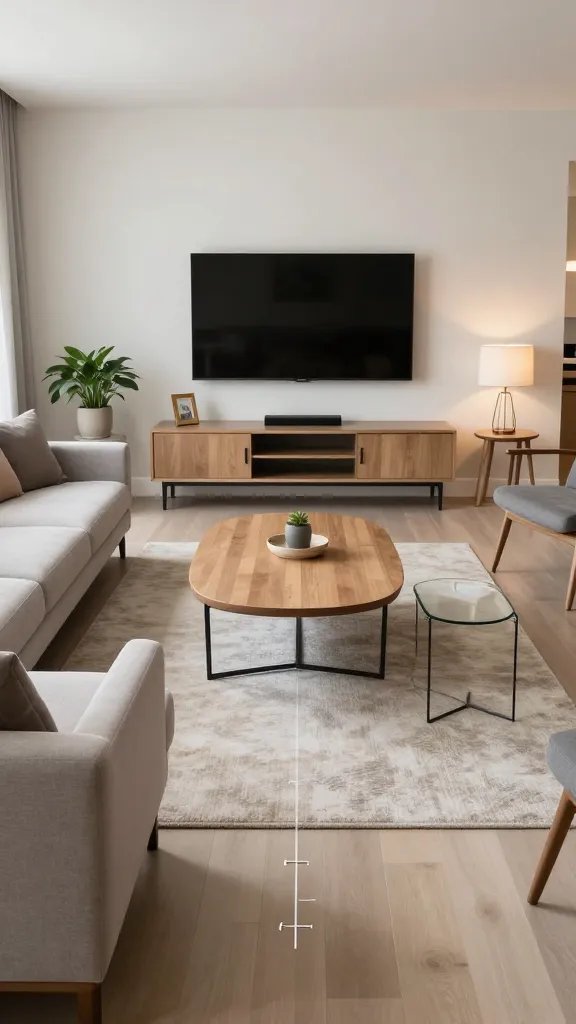
– Measure your seating area and mark an imaginary ring around the couch at 30 inches (roughly arm’s reach). Ensure side tables sit within that zone but don’t extend into the flow path.
– Use one accessible tray or shallow bin per table to corral small items (remotes, chargers) rather than loose clutter.
– Prioritize height variety to avoid long, low sightlines that emphasize tightness.
E. Real-life consideration
In small spaces, consider nesting or wall-mounting surfaces that can fold away—keeps floor clear without sacrificing usability.
F. Common mistake
Choosing oversized coffee tables as a single anchor piece, then filling the rest of the room with scattered decor.
G. Better alternative
Opt for two slim side tables with a shared, shallow tabletop or a single compact coffee table with a lower shelf for storage, leaving floor space open.
3. Underutilizing vertical space and leaving walls blank
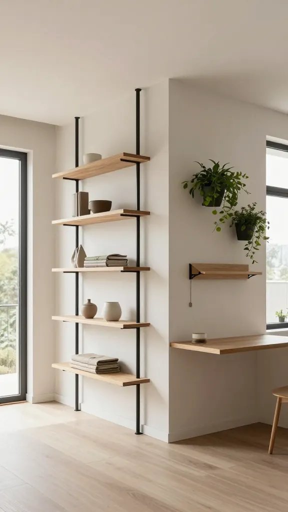
A. The problem
A living room that looks like a “box” because vertical surfaces are left bare makes the ceiling feel low and the room feel boxed in.
B. Why it happens
People fear making walls feel crowded, or they don’t know how to balance vertical storage with aesthetics.
C. The fix
Add vertical interest that also serves a practical storage or display function without overpowering the room.
D. How to do it
– Install a slim vertical shelving unit or staggered wall-mounted shelves along an empty wall. Use shallow baskets or bins to keep items visible and accessible.
– Hang a large, lightweight art piece or a tapestry that pulls the eye upward but uses soft colors to avoid weight.
– Consider a tall plant or a leaning mirror to elongate the space visually.
E. Real-life consideration
For renters, use removable organizers and art hooks that don’t damage walls; choose freestanding étagères with adjustable heights.
F. Common mistake
Filling the lower area with heavy furniture while ignoring vertical opportunities.
G. Better alternative
Combine a tall, slim shelving unit with a high-contrast wall art piece to draw the eye upward and create the illusion of height.
4. Poor seating arrangement that blocks flow
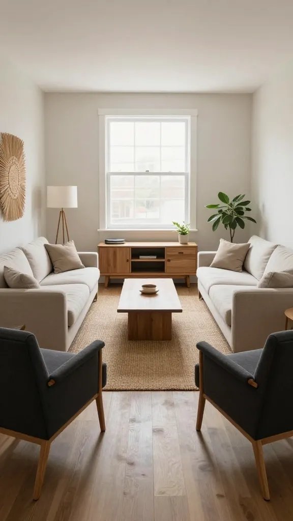
A. The problem
A sofa facing the wrong direction or chairs placed awkwardly creates forced traffic patterns and makes daily movement feel clumsy.
B. Why it happens
We often place furniture to “fit” in, not to facilitate everyday use or conversation paths.
C. The fix
Rethink the seating triangle and resize furniture to keep traffic clear while maintaining social interaction.
D. How to do it
– Position the sofa to create a natural conversation area with 6–8 feet between seating pieces.
– If layout is tight, swap a full sofa for a loveseat or a pair of compact chairs that allow a clear central path.
– Use a narrow console behind the sofa if there’s a wall behind, rather than extra bulky behind-the-sofa seating.
E. Real-life consideration
In apartments with radiators or heat vents, ensure seating doesn’t block heat flow; allow at least 6 inches from vents to avoid furniture shadowing.
F. Common mistake
Pushing furniture against walls with no regard to paths, resulting in a “boxed in” feel.
G. Better alternative
Create a defined seating zone that respects natural walkways and uses furniture with slim profiles on outer edges to keep space open.
5. Ignoring lighting layering in favor of a single overhead fixture
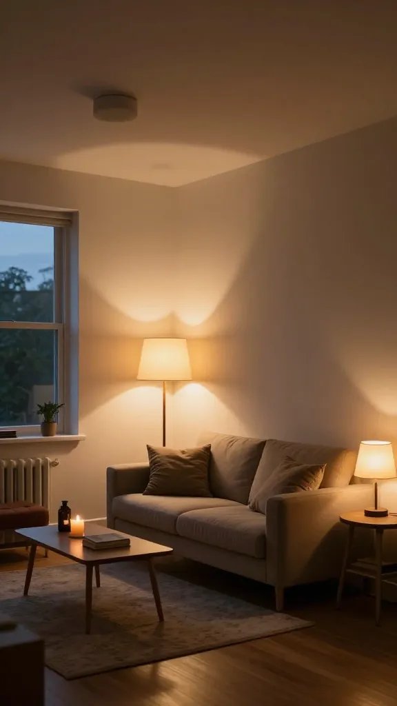
A. The problem
Relying on one overhead light and not considering the way light interacts with furniture and walls makes spaces feel flat and smaller at night.
B. Why it happens
A single source is easy, inexpensive, and often installed by landlords, but it doesn’t help with perceived depth or warmth.
C. The fix
Layer lighting to create pockets of brightness and depth without adding visual clutter.
D. How to do it
– Add two to three lighting tasks: a floor lamp by seating for reading, a table lamp for ambient glow, and a wall sconce or slim pendant to bring upward light.
– Choose bulbs with a warm color temperature (2700–3000K) to feel inviting without shrinking walls.
– Use dimmers where possible to adapt the mood and space perception.
E. Real-life consideration
In rentals, select plug-in floor or table lamps and lightweight wall sconces that can be removed with minimal damage.
F. Common mistake
Failing to consider lighting as a design element, which leaves corners too dark and surfaces too opaque.
G. Better alternative
A balanced triad of light sources creates the sense of airiness and helps define zones, even in a small space.
6. Matching large furniture all around, with no variety in scale
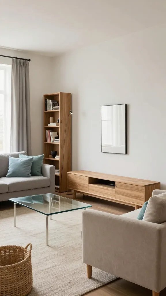
A. The problem
A room full of large seating, a big coffee table, and a bulky media console can swallow space and leave no visual anchor for the eye to rest.
B. Why it happens
People assume bigger is cozier, but in small rooms, scale harmony matters more than total size.
C. The fix
Incorporate a mix of vertical, low, and mid-height pieces to create a dynamic, breathable rhythm.
D. How to do it
– Alternate a slim sofa with a compact loveseat or two armless chairs.
– Use a narrow media console with a shallow depth (less than 14 inches).
– Add a low-profile coffee table with a visible open shelf or two to lighten the floor plane.
E. Real-life consideration
For families, choose sturdy, rounded-edged furniture to avoid sharp corners near kids; for renters, select modular pieces that can rearrange easily as needs change.
F. Common mistake
Balancing everything at the same height and depth, which makes the room feel monotonous and smaller.
G. Better alternative
Introduce varied silhouettes—slim legs, curved arms, short back heights—to create visual air and a sense of depth.
7. Underusing storage that thrives in a small space
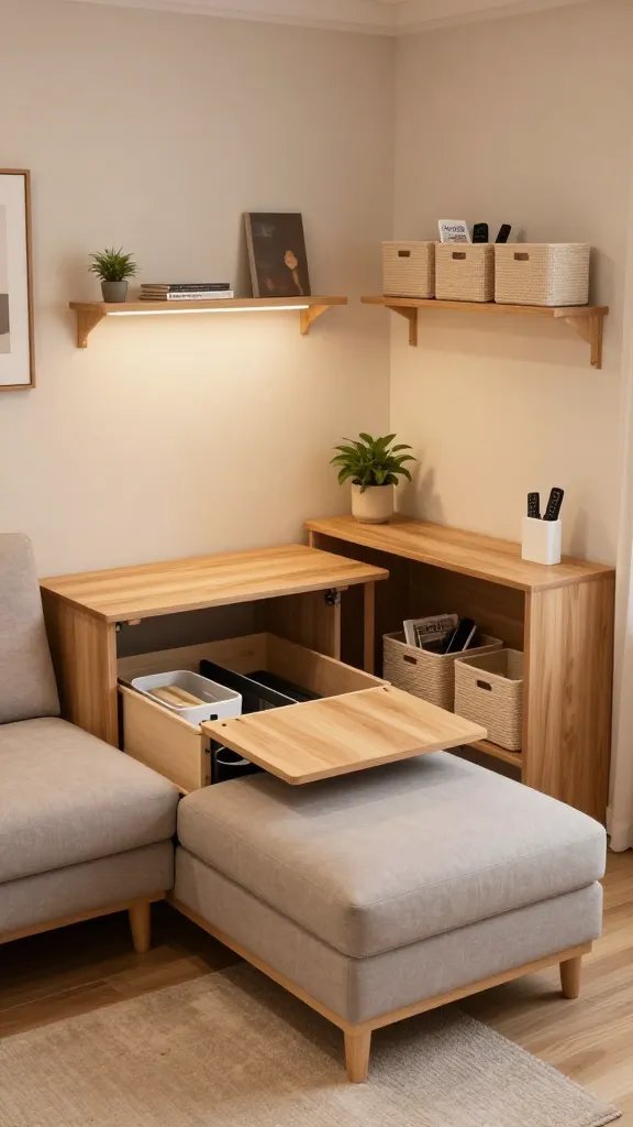
A. The problem
A living room without a clear storage plan ends up with clutter that closes the room in, especially around seating and surfaces.
B. Why it happens
Storage is often an afterthought; when items don’t have a home, they become visible, making the room feel smaller.
C. The fix
Create dedicated, practical storage zones that keep daily items out of sight but within reach.
D. How to do it
– Use a combo of hidden storage (ottomans with lids, bins under coffee tables) and shallow wall-mounted cabinets or shelves.
– Assign a specific bin or box for every frequent category (chargers, remotes, coasters, cords). Label only when necessary for multiple users.
– Pick storage with clear tops or open-front design to avoid digging for items and to maintain visibility of contents.
E. Real-life consideration
In rentals, avoid furniture that requires permanent attachment; instead, use freestanding storage and adhesive organizers that can be removed without residue.
F. Common mistake
Overloading a single storage unit with everything, which makes access slow and the item you need last hard to find.
G. Better alternative
Spread storage across 2–3 compact zones (behind the sofa, under a window bench, and in a media console) to keep daily items accessible yet contained.
8. Poor rug choices that shrink the perceived space
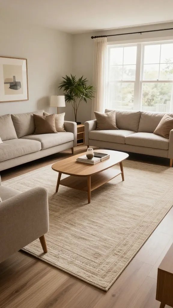
A. The problem
A small room with either an undersized rug that creates “islands” or a large rug that covers too much floor can distort the room’s proportions.
B. Why it happens
People assume bigger is better for warmth or ties the furniture together; neither guarantees spatial clarity.
C. The fix
Choose a rug size that grounds the seating area and respects traffic flow with a clear border around furniture legs.
D. How to do it
– For a typical 10×12 living room, select a rug about 8×10 or 9×12 to accommodate all seating. If you have a sofa and chairs, ensure the front legs sit on the rug.
– If you can’t fit a large rug, use a pair of runners in adjacent zones to create the sense of a cohesive floor plane without overwhelming the room.
E. Real-life consideration
In apartments with wall-to-wall carpet, layer a smaller, neutral textile under a coffee table instead of a full replacement rug to avoid color clashes and extra texture.
F. Common mistake
Choosing a rug too small because it’s cheaper, which makes the seating appear adrift.
G. Better alternative
Aim for a rug that embraces all seating pieces’ front legs, or if budget is tight, layer a larger rug with a smaller one to define zones without breaking the floor plane.
9. Overstocked shelving that hides items, not displays them
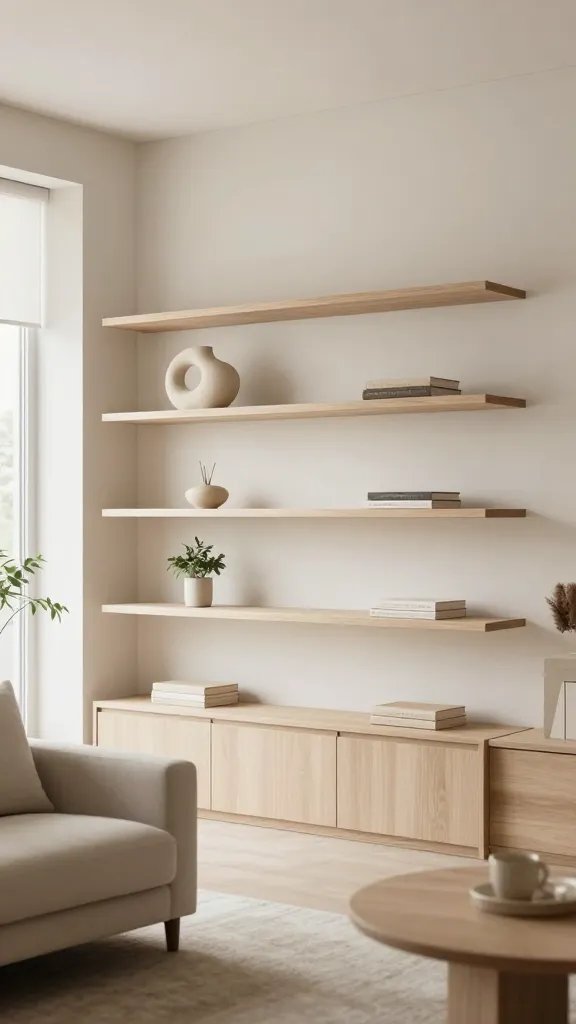
A. The problem
Shelves loaded with decor, books, and knickknacks in every possible surface signal clutter and crowd the eye.
B. Why it happens
People want to maximize storage, but stacking things visually compresses the room and makes it hard to find what you need.
C. The fix
Adopt a “display with intention” rule: every shelf should have a focal item and a defined purpose for the rest (storage, display, or hidden storage).
D. How to do it
– Limit open display to 1–3 items per shelf, with ample white space around them.
– Use uniform storage bins or labeled boxes on the lower shelves to conceal clutter.
– Reserve one shelf per wall for a bold, single object (large plant, sculpture, or framed art) to draw the eye upward.
E. Real-life consideration
In rentals with adjustable shelving, avoid over-reliance on the top shelf where items become fragile or unstable; keep heavier items lower for safety and accessibility.
F. Common mistake
Filling every available rail with books and decor, leaving no room for new items or seasonal changes.
G. Better alternative
Create one “anchor shelf” with three levels of balance and two additional shelves kept almost bare to promote air and reduce visual noise.
10. Hiding the cords and outlets with furniture and fabric
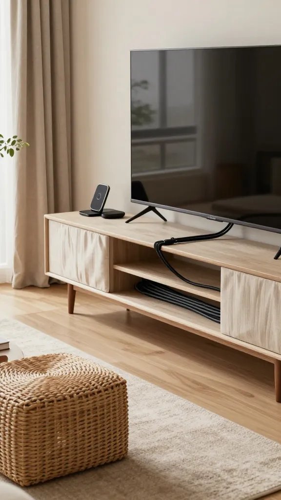
A. The problem
Cables sprouting from lamps, TV stands, and devices create a visual mess that makes the room feel smaller and less calm.
B. Why it happens
Limited outlets and set-piece electronics push you toward tucking cords behind every piece of furniture, which quickly looks chaotic.
C. The fix
Create a simple, organized cord management system that is visible and accessible but unobtrusive.
D. How to do it
– Use a shallow cable management box or a Velcro-tied bundle under a TV stand.
– Run cords along the back of furniture using adhesive clips to keep them off visible surfaces.
– Prefer wall-mounted power strips if possible and safe, with cords routed into a discreet channel behind the furniture.
E. Real-life consideration
In rentals, surge protectors and power strips can be mounted with removable adhesive; avoid drilling into walls. Consider a furniture-grade cord cover if you have to cross a visible hallway or doorway.
F. Common mistake
Covering cords with a decorative throw or a basket—these hide hazards, not solve them, and still create a cluttered look.
G. Better alternative
Integrate a minimal cord plan: one outlet per seating zone, a single surge strip, and visible but organized cord channels to keep everything tidy.
11. Too many lighting sources with no control
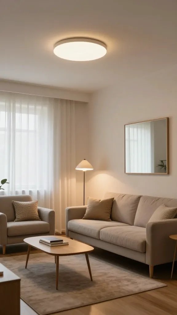
A. The problem
When every surface has a light, you end up chasing shadows and reflections that fight for your attention and shrink the room visually.
B. Why it happens
People add lamps to fix dark corners but don’t consider how the light interacts with furniture and walls.
C. The fix
Establish a lighting plan that prioritizes function and mood while respecting the room’s flow.
D. How to do it
– Allocate lighting zones: a primary ceiling light, a seating-area floor lamp, and a reading light near chairs.
– Use dimmable bulbs and a low-wattage option for general ambiance; reserve brighter task lighting for activities that need focus.
– Employ wall-mounted options where floor space is precious, such as a swing-arm lamp by a chair.
E. Real-life consideration
For renters, wall-mounted sconces or plug-in swing-arm lights are ideal as they require no major renovations; keep cords tidy with clips and channels.
F. Common mistake
Using near-visible ceiling fixtures alone; it makes the ceiling feel lower and the room flatter.
G. Better alternative
Layered lighting with a mix of ambient, task, and accent light creates depth and makes the space feel larger by avoiding flat lighting.
12. Reflective surfaces that bounce too much light and reveal clutter
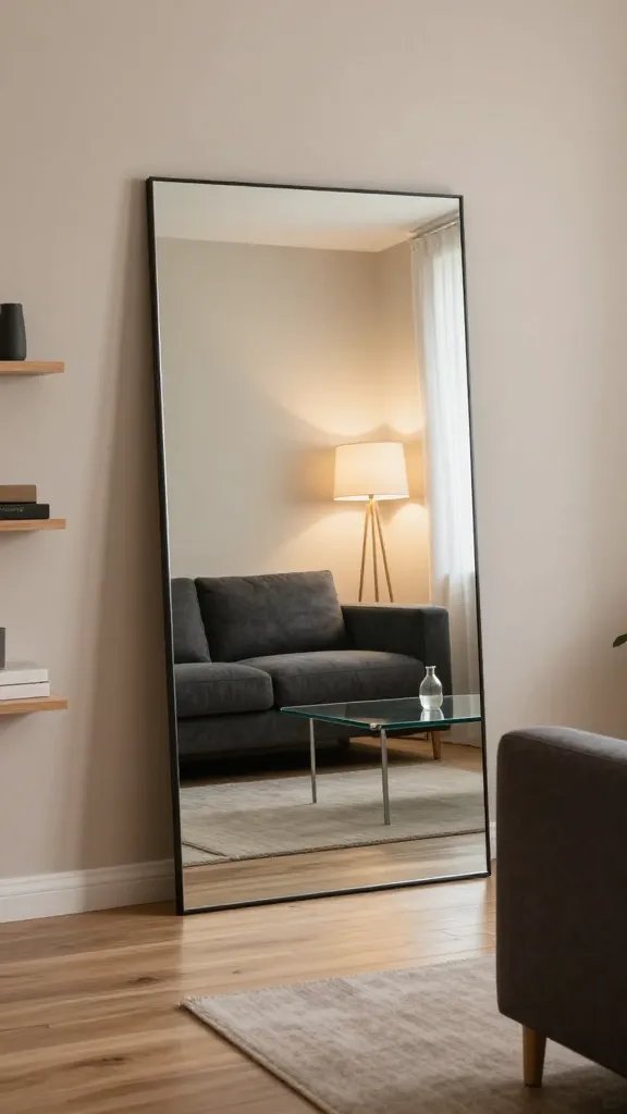
A. The problem
Mirrored or glossy surfaces reflect everything around them, including clutter, which can magnify the perception of a crowded room.
B. Why it happens
Mirrors and glass are celebrated for making spaces feel larger, but when framed with busy surroundings or clutter, they expose disarray instead of depth.
C. The fix
Use reflective surfaces strategically to bounce light, not to reveal chaos.
D. How to do it
– Place a mirror where it reflects a view of a calm area plus a light source.
– Choose a mirror with a soft, non-distracting frame or lean a large, frameless mirror against a wall to avoid a fixed focal point that screams “you should see everything.”
– Keep tabletops and shelves around reflective pieces minimal and clean.
E. Real-life consideration
In small apartments with limited wall space, consider a tall, slim floor mirror that adds height without gobbling floor area.
F. Common mistake
Overloading a wall with multiple glossy frames and mirrors that reflect the same clutter from different angles.
G. Better alternative
A single statement mirror or a strategically placed glass-tinish panel that expands depth without multiplying reflection points.
13. Inflexible layouts that don’t adapt to cargo or life changes
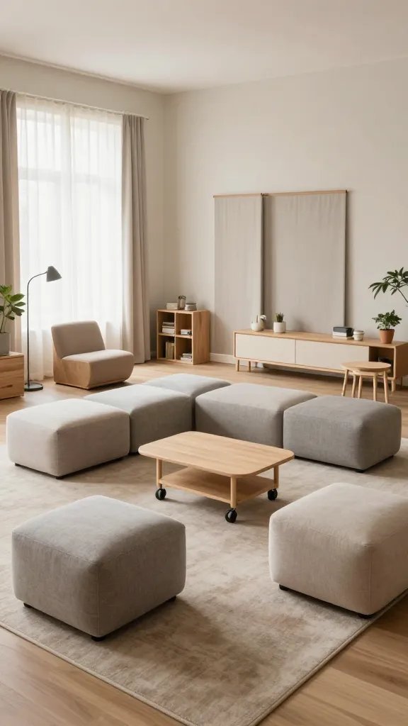
A. The problem
A fixed layout works on paper but rarely supports real life—kids, guests, or new furniture need space to breathe, yet the room can’t flex.
B. Why it happens
We design rooms as if they’re static showcases, not living spaces with evolving needs.
C. The fix
Create modular, reconfigurable zones that can shift with use without major overhauls.
D. How to do it
– Use modular seating that can be rearranged into a conversation nook, a small lounge, or a reading corner.
– Keep one seating option on casters or with easy-to-move legs to pivot the layout readily.
– Use a lightweight, neutral room divider or a tall plant to section space when needed but remove easily when not.
E. Real-life consideration
In rentals, avoid custom-built walls or fixed furniture; prioritize furniture that can be moved or rearranged without damage.
F. Common mistake
Locking into a single layout because it looked perfect in a photo, but it doesn’t work for busy households or small kids.
G. Better alternative
Plan a primary layout and a seasonal or guest layout. Use lightweight pieces that can be rearranged in under an hour.
14. Overattachment to matching “set” furniture
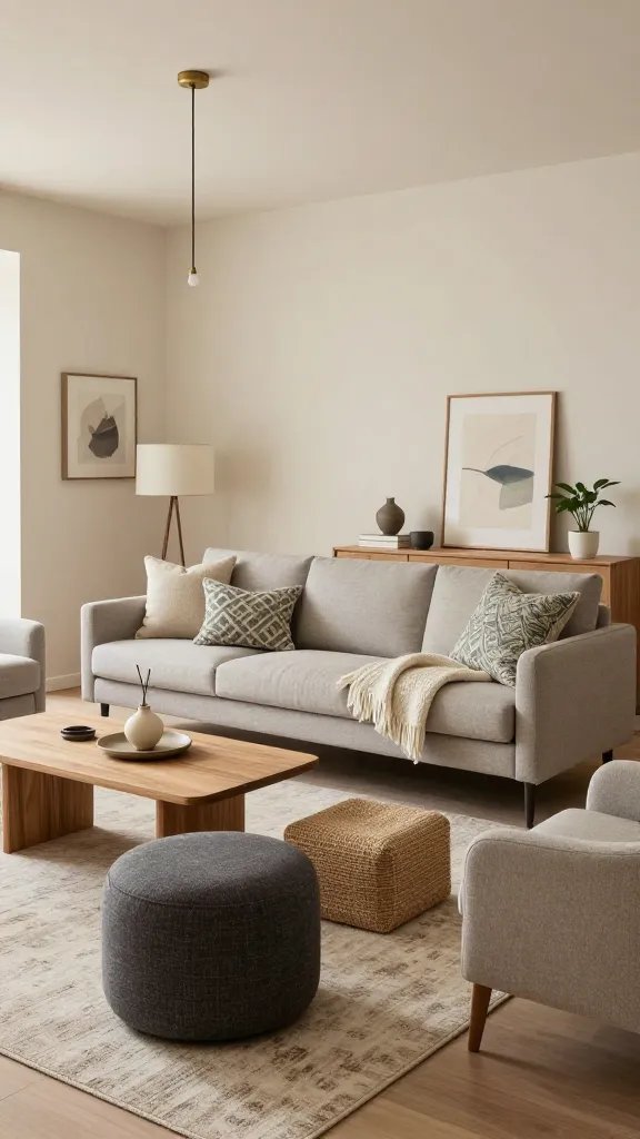
A. The problem
A homogeneous suite of furniture can feel heavy, boxy, and visually claustrophobic, especially when all pieces share the same footprint.
B. Why it happens
A desire for a cohesive, “finished” look leads to buying a matching set, which can be impractical in small rooms.
C. The fix
Mix scales and textures to create depth while maintaining a cohesive color story.
D. How to do it
– Pair a mid-sized sofa with a couple of ottomans or stools that double as extra seating or a coffee table.
– Introduce a chair in a contrasting texture or color as a focal accent.
– Keep the color palette narrow (two neutrals and one accent) to avoid a visually chaotic space.
E. Real-life consideration
In families with kids, choose durable fabrics and finishes; avoid stark white or high-sheen surfaces that show scratches quickly.
F. Common mistake
Buying a complete matching room because it sells well in stores, then discovering it limits flexibility and scale as needs evolve.
G. Better alternative
Create a “soft match” by tying the pieces together with shared color or texture rather than identical shapes.
15. Neglecting traffic flow in open-plan spaces
A. The problem
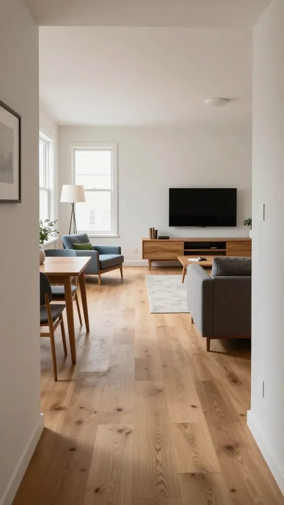
Open-plan rooms accumulate furniture in a way that blocks efficient movement, making daily tasks feel chaotic and space feel smaller.
B. Why it happens
People design the space around a single focal point rather than the actual paths people take through the room.
C. The fix
Map the main walk routes and ensure furniture doesn’t interrupt them.
D. How to do it
– Mark a path that resembles a typical route from entry to seating to a TV or fireplace.
– Place larger pieces along the edges of that path, leaving at least 32 inches of clear width for foot traffic.
– If needed, move a bulky piece to another wall or swap it for something lighter to revive flow.
E. Real-life consideration
In small apartments with restricted doorway widths, test moving the longest piece through the doorway and ensure it doesn’t become a barrier to entry.
F. Common mistake
Treating the space as a sculpture rather than a functional floor plan; walls become borders that don’t guide movement.
G. Better alternative
Use furniture with open sightlines and slender profiles on the traffic side to keep the space feeling breezy and accessible.
16. Ignoring storage in plain sight for the sake of aesthetics
A. The problem
Home owners hide too much in cabinets or close it off entirely, which creates a perception of disorder when you finally reach for items.
B. Why it happens
A longing for a clean surface takes priority over everyday practicality, leading to unnecessary concealment and extra clutter later.
C. The fix
Designate visually neat, accessible storage zones that you actually use every day.
D. How to do it
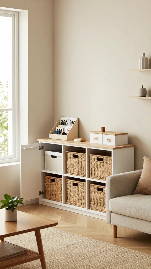
– Create a “catch-all” closet or bin in a defined spot for keys, mail, and daily items, but keep it organized with 2–3 trays or bins.
– Use a shallow, labeled bin near the entry to hold remotes, chargers, and kids’ small toys; keep it in a place that’s easy to reach but not in the main living zone if it clutters sightlines.
– Keep a small basket under the coffee table for remote controls and coasters that would otherwise sit on the table’s surface.
E. Real-life consideration
For renters, reuse existing storage with baskets and boxes on shelves, and avoid installing anything that would require a lot of patching when you move out.
F. Common mistake
Piling up surface clutter and calling it “decor,” which makes the room feel smaller every day.
G. Better alternative
Make functional storage visible and attractive: a labeled bin that doubles as decor, a shallow tray for daily items, and a simple, clean surface with one well-edited object as a focal point.
17. Too many electronics dominating the focal wall
A. The problem
A wall with a TV, gaming consoles, speakers, and all their cords creates a heavy, chaotic focal point that shrinks the room visually.
B. Why it happens
The wall becomes a gear hub; cables and devices pull attention away from human-scale activities and conversations.
C. The fix
Organize electronics into a clean, minimal footprint that prioritizes human activity zones over tech clutter.
D. How to do it
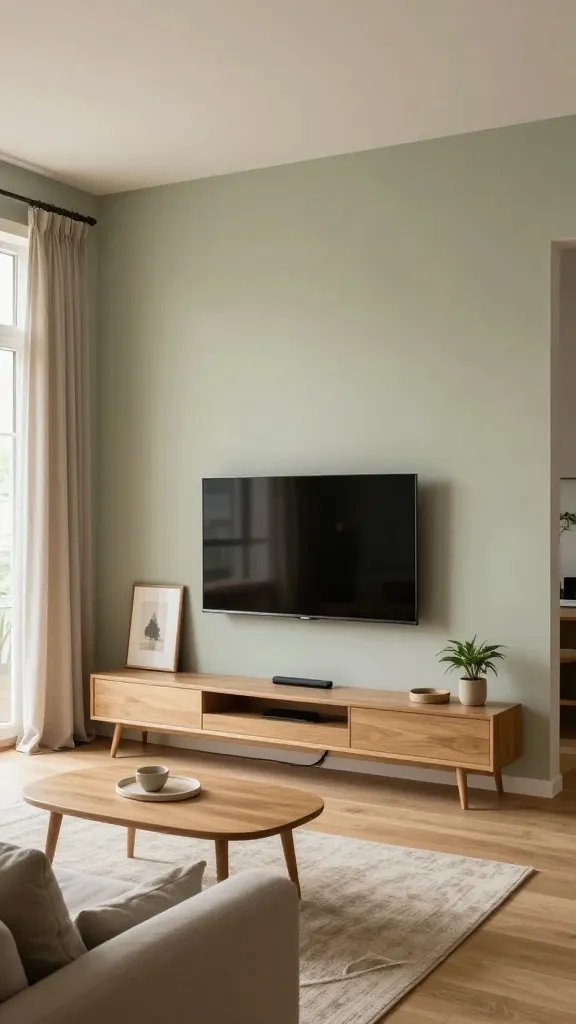
– Mount the TV at eye level and use a slim media console to hide most components.
– Use a single, centralized power strip and hide cables with a cable cover or behind the console.
– Where possible, group devices into one zone rather than allowing a scattered network of gadgets across the wall.
E. Real-life consideration
In rentals, consider a modular media unit with cable management features you can adjust as devices change.
F. Common mistake
Using open shelves for every device and letting wires trail everywhere, creating a visual maze.
G. Better alternative
Keep one wall visually calm by limiting technology to one zone and tucking away little devices when not in use.
18. Seasonal clutter that never gets stored away
A. The problem
Seasonal décor and items pile up in living rooms because there’s nowhere designated to hide or store them, making the space feel cluttered and smaller.
B. Why it happens
Lack of a clear seasonal storage plan and insufficient secondary storage in the room itself.
C. The fix
Create a simple, rotating seasonal system that stores and returns items on a predictable schedule.
D. How to do it
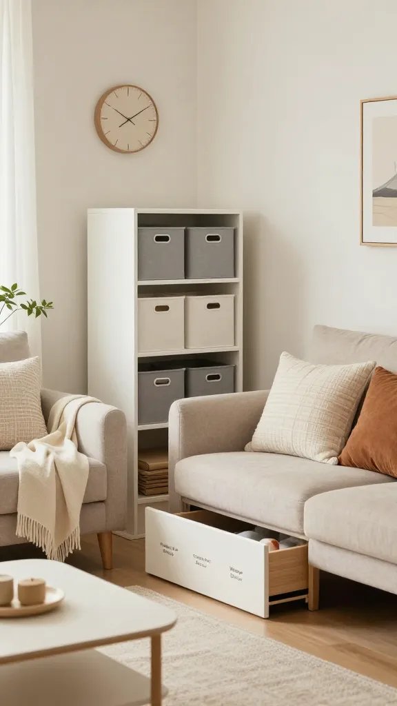
– Dedicate a small bin or bin system for seasonal accessories (pillows, throws, coastal decor, etc.).
– Store off-season items in a closet, under-bed containers, or a high shelf; rotate every 3–4 months.
– Label and keep a quick-access card of what’s in each container to avoid frantic searching.
E. Real-life consideration
In apartments with limited storage, use under-sofa storage boxes or a slim, tippable storage ottoman for seasonal items that you do not use daily.
F. Common mistake
Hoarding seasonal decor on coffee tables and shelves, which creates a constantly changing surface that never feels calm.
G. Better alternative
Keep one dedicated storage system for seasonal items and a short list you can refer to when rotation is due, ensuring the living room stays calm year-round.
19. Ignoring scent and texture balance that affect perception
A. The problem
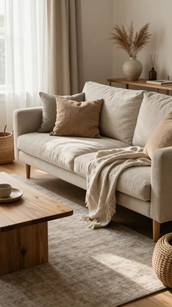
Texture and scent are often overlooked in the push for visual order, yet they impact perceived space and comfort deeply.
B. Why it happens
We focus on sight and storage, forgetting that touch and smell influence how big or cozy a space feels.
C. The fix
Enhance the room with a few sensory-friendly elements that make the space feel larger and more welcoming.
D. How to do it
– Introduce a soft, breathable textile—think a cotton or linen throw; limit to 1–2 colors to keep calm.
– Add a natural element with a tactile rug or woven basket, using texture to define zones rather than color disruption.
– Use a calm, subtle scent (diffuser, candle) and rotate scents seasonally to avoid overwhelming the room.
E. Real-life consideration
If you have kids or pets, choose flame-free, clean-burning options and materials that are easy to wipe or wash.
F. Common mistake
Over-looking texture and scent altogether, relying solely on color and furniture to define the space.
G. Better alternative
Carefully layered texture with a restrained scent plan enhances perceived space without adding visual clutter.
20. Not setting up a simple, repeatable maintenance plan
A. The problem
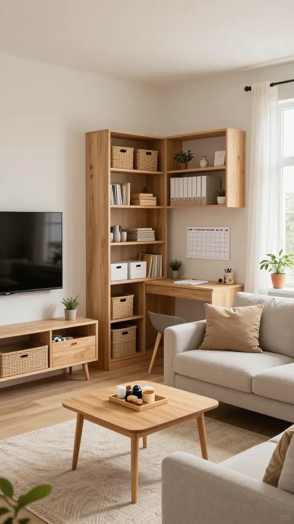
After organizing, you stop maintaining the system and items drift back into clutter, shrinking the space again.
B. Why it happens
People mistake “organizing” for a one-time action rather than a routine, especially in small spaces where clutter re-accumulates quickly.
C. The fix
Establish a 10-minute daily maintenance routine and a quarterly deep-reset plan that fits real-life schedules.
D. How to do it
– Daily: 5-minute reset before bed (clear surfaces, return items to their homes, quick trash/recyle sweep).
– Weekly: check one storage zone, wipe surfaces, and store items properly.
– Quarterly: reassess the space, rotate seasonal items, and adjust zones if you’ve added or removed furniture.
E. Real-life consideration
For households with kids or pets, involve everyone in the quick reset and give each person a clearly defined “home” for their items.
F. Common mistake
Thinking once organized equals always organized; in reality, systems require routine engagement to stay effective.
G. Better alternative
Turn maintenance into a habit by tying it to a weekly routine (e.g., Sunday evening reset) and keeping the process simple and fast.
Before you buy: a quick decision guide for small-space storage and furniture
When you’re faced with a new storage solution or a decorative piece, use these decision rules to avoid waste and misalignment with your space:
- If you use it every week, keep it within easy reach; if not used for two seasonal rotations, question its prime storage value.
- If a storage container makes an item harder to see or reach, it isn’t solving the problem.
- If you need to move three things to reach one thing, the storage system needs to change.
And a reminder: start by measuring the space, identify items that truly need storing, remove what you don’t need, and check whether existing containers can be repurposed before buying anything new. If you must buy, choose products that solve a specific problem, not just look good.
Occasionally useful tables to compare ideas
| Storage Solution | Best For | Potential Drawbacks | Budget |
|---|---|---|---|
| Slim wall-mounted shelves | Vertical display + storage | Requires wall space; installation may be limited in rentals | Low–Medium |
| Low-profile storage ottoman | Hidden storage + extra seating | Limited capacity; not ideal for small kids | Medium |
| Nesting tables | Flexible surfaces without crowding | Smaller top surface when nested | Low–Medium |
| Clear-top bins | Visibility + quick access | May look utilitarian if overused | Low |
Conclusion
The core problem isn’t the footprint of your living room; it’s how the space is used, observed, and accessed every day. By addressing distinct issues—from clutter management and seating scale to lighting, traffic flow, and practical storage—you can reclaim real inches in perception and make your small space feel larger and more livable. Start with one or two high-leverage changes, such as rethinking seating layout for better flow and layering lighting for depth. Then implement a straightforward maintenance routine to keep the improvements lasting. Your goal isn’t perfection; it’s a space that works with your life, not against it.
FAQ
What should I remove first in a crammed living room?
Start with items that block pathways or visually crowd surfaces: bulky coffee tables, excessive throw blankets, and decor that sits directly on the floor or on every horizontal surface. Clear surfaces in 2–3 protected zones to restore air and ease of use.
How do I organize storage in a rental with limited wall space?
Use freestanding units with adjustable shelves, under-sofa storage bins, and over-door or behind-door organizers. Choose removable wall hooks and adhesive organizers that won’t damage walls, and keep the floor plan intact for easy reconfiguration when you move.
What’s the simplest way to improve lighting in a small living room?
Layer lighting with one ambient fixture, one task light, and one accent option (like a wall sconce or floor lamp). Use dimmable bulbs to adjust mood and perception of space without buying multiple fixtures.
How can I ensure a small space feels open without sacrificing function?
Prioritize function with modular, movable pieces, open sightlines, and varied but restrained textures. Keep the most-used items within easy reach and rotate seasonal or rarely used items to off-site storage when possible.
What is the quickest way to fix a cluttered wall behind the seating area?
Remove everything from the wall, choose one focal item (art, mirror, or a vertical plant), and rehang with intentional spacing. Then introduce a slim storage option nearby to keep daily items out of sight but accessible.